CKKNT
We enjoy it when every project is different. We are not tempted to do only one type of work. After all, bookmaking is the mother of printing crafts. We enjoy tackling different, sometimes a little crazy assignments. We like adventure and we like to be inspired by our clients. This time we're going to present you with 5 different assignments that required 5 different solutions. In short, 5 different inspirations that all had one thing in common: we used materials from Lessebo.
CRYSTALEX - A traditional brand that cares about packaging.
Glassmaking is an exciting adventure that results in beautiful products. And it would be a shame to send these artefacts of human skill on their way to customers in some inferior boxes. The Czech glassworks Crystalex would not make such a mistake. Its progressive marketing team has kept the brand image from A to Z. Thanks to this, their glassmakers pack the results of their work into unique boxes, which we produce from Lessebo's microwave. We solve the graphics by embossing or screen printing.
KINDLY - Packaging as part of the product.
The product box may not just be a necessary evil that protects the contents during shipping, but then it ends up in the trash. For the Kindly brand, which supplies dietary supplements in the form of capsule bags, we have designed special multi-purpose boxes. They are not only for transport, but also for smart serving. After tearing off the securing strip, you dispense one sachet after another by rolling until the pack is empty. We used a strong Scandia 2000 board with a Stucco texture, complete with offset printing and fine embossed detail.
KLARNA - Luxury from A to K.
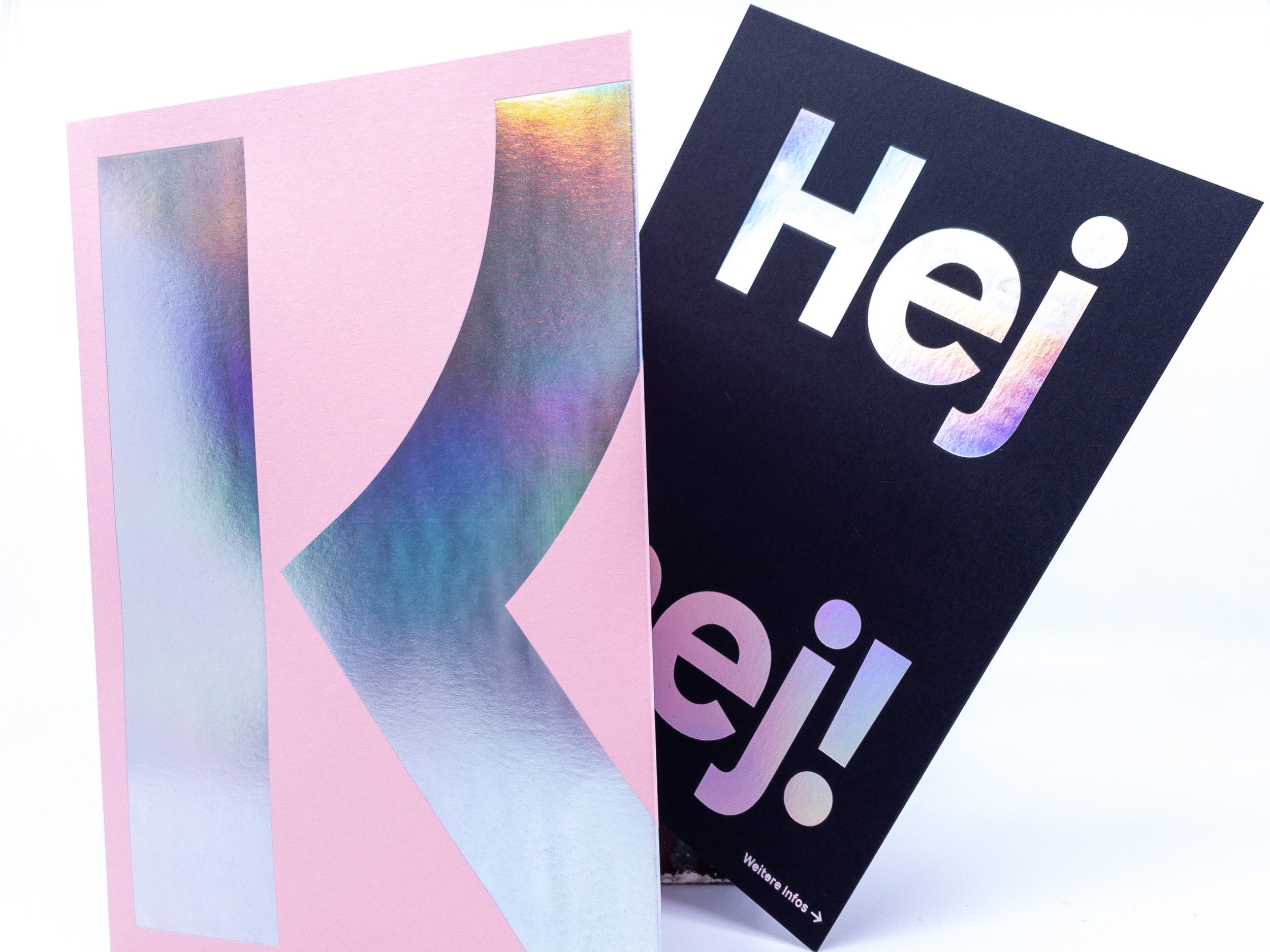
Did you also get a new credit card from your bank in a hopelessly boring white envelope? Swedish fintech Klarna wouldn't stoop to something like that. The brand prides itself on offering customers "smoooooth...." service. And so is the card cover. Simple at first glance, adorned with a giant holographic letter K. You curiously tear off the security seal and there's a greeting: "Olá. Hello. Ciao." Unwrapping it is a joy! For us, the challenging embossing was a joy, and in the end the special Flamingo-coloured cardboard did a great job. Thanks Lessebo!
NINE YARDS - Nice and sharp design.
The brand identity of Nine Yards cosmetics includes the dramatic shapes of the bottles with sharp edges. So it goes without saying that we wanted to infuse these distinctive features into the final packaging. We produced a series of coated boxes with razor-sharp milled edges. We used four of the great Lessebo Papers colours, which is also a super stable material for machine coating. Plus, it tolerates hot stamping without any problems. And the result is literally exclusive.
TERSHINE - Complications to beauty. Your car.
The minimalist Mies van der Rohe would probably disagree, but sometimes the simplest shapes are not enough and less becomes more. The brief from Tershine car cosmetics was - we want packaging that makes customers gasp in amazement. Together with the AFBKK printer, we realized the complicated pull-out box of the Burgopak design. Despite the challenging composition, the whole is compactly made of black Lessebo cardboard, which is decorated with contrasting white screen printing.
We hope we have inspired you too. And we look forward to seeing what adventures we'll take together next.


