DESTIGMATIZATION OF HUMAN DIGESTION
When it is necessary to present such an intimate matter as human digestion in an engaging way, it is quite a puzzle. In addition, if you make 100% of your sales online, thoughtful packaging must convey the essence of the brand.
"We decided to create a product so beautiful that customers will want to show it off. And that it will be talked about, no matter what it's for," says Kurppa Hosk, head of the Stockholm-based agency that was given the aforementioned puzzle to solve.
Kalla is a fast-growing concept of probiotic products whose quality is based on scientific research. You might be thinking that digestion is not exactly a topic for a latte. But Kalla needed to make it such a topic. Because its success is built on online sales - so is social media and sharing.
The Kurppa Hosk agency has therefore built a brand on packaging that captivates and literally cries out to be shared. What's more, it can become a pleasant addition to any customer's interior. In fact, the packaging has given the product tactile, visual and emotional qualities without which it would be interchangeable and lost in the digital world. Our craft, which we call "Upgraded Bookbinders", was made for such a purpose.
The agency approached our colleagues from Profilskaparen, who realized the entire series of packaging in our production. The design is based on a combination of the unique characteristics of Japanese Takeo Satogami paper, kraft cardboard and white screen-printed and embossed typography.
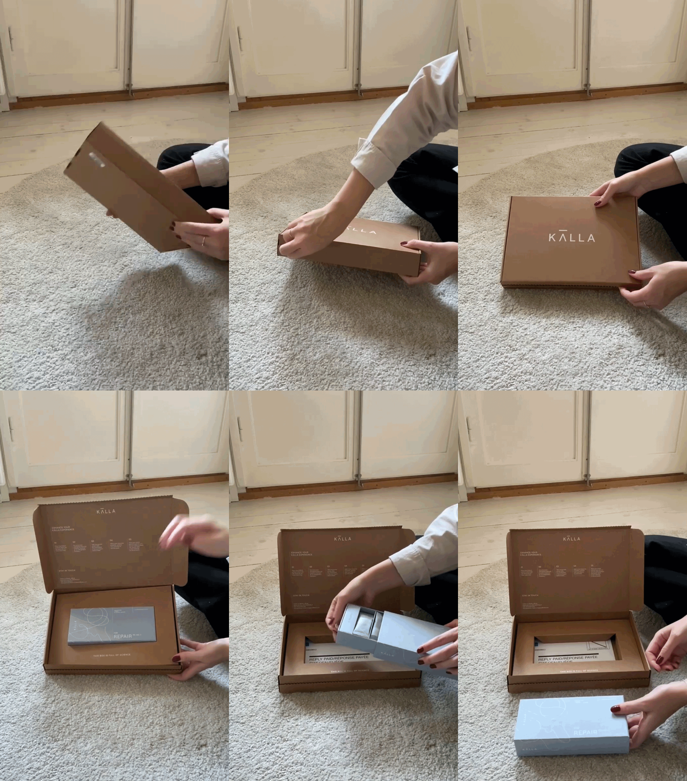
The solution is based on four variants of a coated box that slides out of a special cassette. The product lines are differentiated by the different paper shades Pale Blue, Rust, Light Green and Light Grey. It may sound simple, but the production path for all 5,000 pieces of packaging was quite thorny.
The paper from Japan had to be delivered to the screen printing virtuosos at Protrade. From them, the series headed for coating in the hands of experienced masters from the Hospa factory in Bystřice pod Hostýnem. In the end, we took everything to Roblin, where in the meantime we prepared the accordion inserts for the individual bags of probiotics. Then we put a cotton "off white" ribbon in a hole in the front of the box and finally put everything together.
But that was not the end. Kurppa Hosk are no pencil sharpeners, so they gave the mailers the same care as the boxes. Packaging had to be prepared for mailing one, two or three products. These were simple fefco 0427 boxes rendered in kraft cardboard with brilliant screen-printed graphics in white. You don't send a customer a crumpled postal box from which they would then fish out the contents drowned in bubble wrap. Even a parcel can be a design piece. The recipient curiously tears off a strip in the front of the box and opens a beautiful cassette with a drawer. A package he will be happy to put on his corian board. A perfect experience.
That's the kind of work we like. No - we're a garage company and we're a knee-jerk brand. We believe it pays to make an honest investment in a top-notch agency and quality packaging made by experienced professionals with their own hands and great materials. The 5,000-pack series for the Kalla brand was an interesting challenge. In addition to our own bookbinding know-how, we again had to add the skills of our proven suppliers. And all honest handcraft. Upgraded bookbinders just live! And experiencing it has become a topic of conversation over coffee in many Nordic design cafes.


