Luxuriously burnt packaging


The finely textured Colorplan paper impresses with its rich plum blue colour, from which the snow-white screen printing and gold embossing stand out intensely. The sophisticated, complex construction fulfils our idea of a luxurious cover to the last drop.
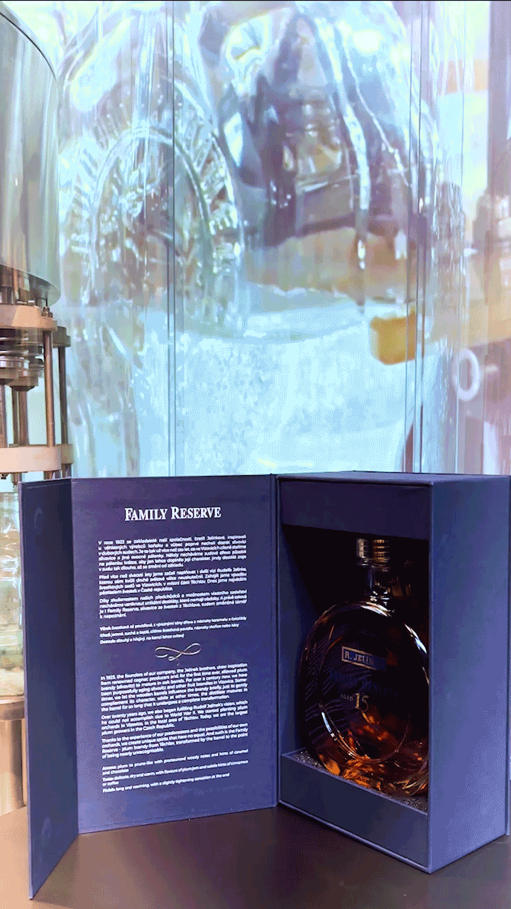
Every last drop? That's right - we take the liberty of paraphrasing the characteristics of Family Reserve 15yo slivovitz from the production of Rudolf Jelinek, who became our client. We are delighted that a traditional Czech distiller with a history of more than 400 years chose us at Hässlers. We share the same respect for traditional craftsmanship. At Jelinek, they also pride themselves on the careful selection of materials-raw ingredients from their own orchards, which are then processed on modern machines, but using traditional methods. However, it is not only the philosophy of production that we have in common; Jelínek's orchards are also a stone's throw from our workshop. Simply an ideal match.
We have partnered with the packaging of a unique, 15-year old slivovitz that is aged in oak barrels. The construction of the box is durable, we conceived it for long-term storage of the collector's edition of alcohol. The base is a coated box in four-piece boards with a subtle but forever functional magnetic closure. However, the essentials are inside. The bottle is housed in a carefully composed interior precisely assembled from solid coated parts and foam. As a result, the box can be displayed for long periods of time, even open, without the construction suffering any damage over time. We see the limit completely in the luxurious mahogany bookcase of the stylish study, where the owner and guests enjoy a complex impression that combines the best of the Bohemian distiller's and bookbinder's craft.
As we have already mentioned, we have chosen the material Colorplan (with Buckram structure) for the packaging, which of course refers to the original raw material of Jelinek brandy - plums. Due to the collector's importance of slivovitz, the packaging is complemented by a series of texts, which we have implemented in white screen printing. They stand out slightly from the surface of the textured paper and look really great. The design is complemented by visually dramatic gold embossing, which enhances the effect of the luxury liquor chest.
To produce a box like this in this quality requires a wide range of bookbinding and printing techniques. From this point of view, the packaging composition for the Jelinek Family Reserve 15yo is also a "pure" craft. Only a few elements of the whole puzzle were processed automatically - the concept and assembly required creativity, experience and, above all, skillful hands. Fortunately, we have enough of all that at Hässlers. By thoughtfully combining machine and hand production, using purposefully selected materials, we also manage deadlines that are sometimes out of the realm of dreams. But it's these unique projects that we enjoy the most. Let us know what we can burn for you next time!