Version "Hässlers Pro"
An even bigger display, even more power, an even faster processor... This is how Apple marketers teach us to perceive the Pro version. For us, though, it's still mostly shorthand for "professional" - so products for professional use. For work, for creative activity, in short, any business. Such products are in heavy use every day, and the success or downfall of the company that uses them can depend on their quality. That's why we pay attention to them in a special line "Hässlers Pro".
There are many industries where our products are part of what is called "business as usual". They're a work tool and must be designed as such - durable materials, subtle or bold and crazy graphics. But always in the highest quality. We have selected 3 industry solutions where the impression of honest bookbinding rolls over the now standard impersonal digital tools.
BANKS - TO ESTABLISH A TRUSTING RELATIONSHIP WITH THE CLIENT
The banking business is very conservative and unless marketing puts on a "cool" mask for younger clients, it holds on to its traditional position. It is simply part of banking to be respectable. But although banking is now almost exclusively an electronic affair, the physical evidence of bank patronage has not lost its charm - perhaps quite the opposite. Banks and users are paying much more attention to them. And we know how to make that moment of real contact memorable.
For example, we produce special packaging for Platinum cards for Handelsbanken, one of the largest banks in Sweden. They will arrive to clients in coated boxes with magnets, all compactly dressed in grey Colorplan Smoke, including the interior. For Nordea Bank, which operates throughout the Nordic region, we implemented a three-part packaging - envelope, pocket and card holder. And it comes in different material options for the Black, Premium and Platinum lines. Always in an exclusive spirit, with carefully selected cardstock colours and embossing for each set. Muted grey and dark blue tones, subtle textures and embossed graphics - this is packaging that embodies solidity for an intimate relationship with the client.
REAL ESTATE - FOR AN UNFORGETTABLE PRESENTATION WITHOUT A TABLET
Real estate agents and developers present and sell huge values. Not just financial, but also life. It goes without saying that the client wants to see everything carefully. They need to take the documents home, reflect on them, soak up the atmosphere of the property. He doesn't want to sit in the evening by the fireplace with a glass of whisky over a web presentation or a cheap catalogue from a supermarket. That is why the Sky City Villas project by architect Ivan Kroupa for the Prague developer Conti Development deserved a real pictorial publication. We realized it as a flat binding, i.e. a full-flat book, in which the layout of large-format visualizations does not disturb anything.
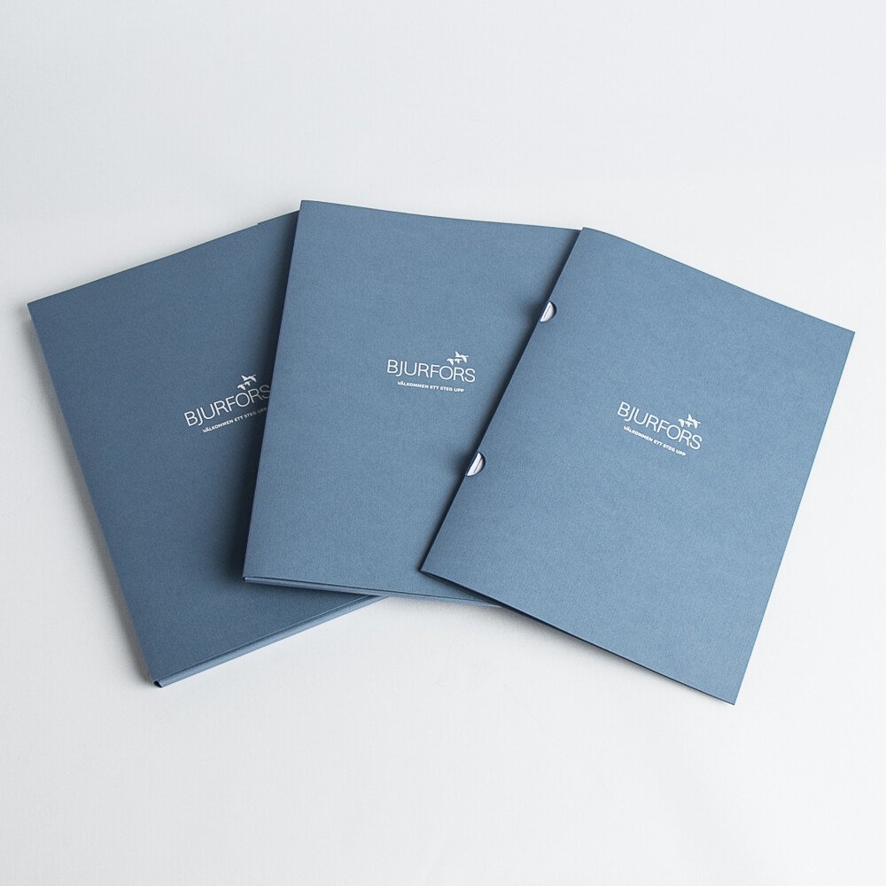
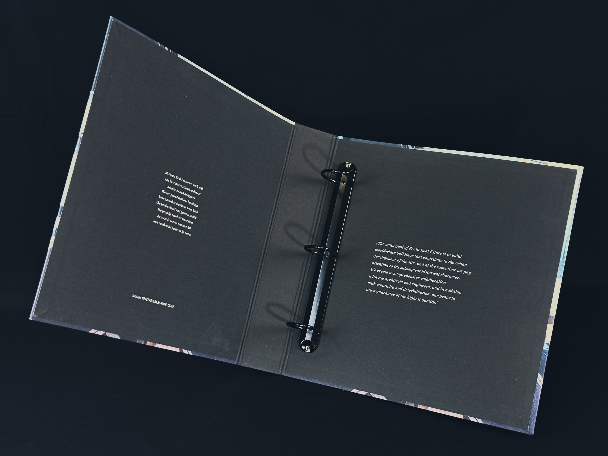
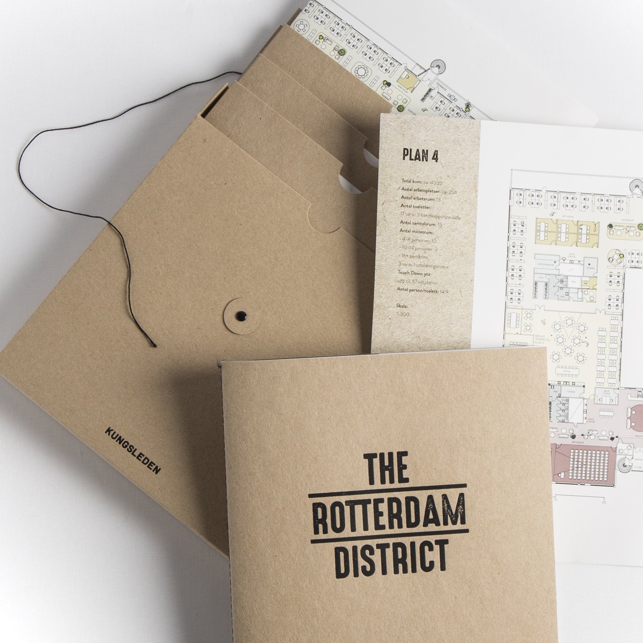
For a stylish presentation in a busy real estate office, we have prepared folders and precision ring binders. In no time at all, you take them out of the bookcase and a new world opens up for the client - which they can also take home, because you've given them a presentation to take home with them. Preferably in a bag in the same style. We have implemented a number of similar solutions for prestigious offices such as MOHV, HusmanHagberg, SMH, Bjurfors and others. For the real estate segment, our favourite material is canvas or finely textured but approvable paper.
HOSPITALITY - FOR A COMPLETE EXPERIENCE
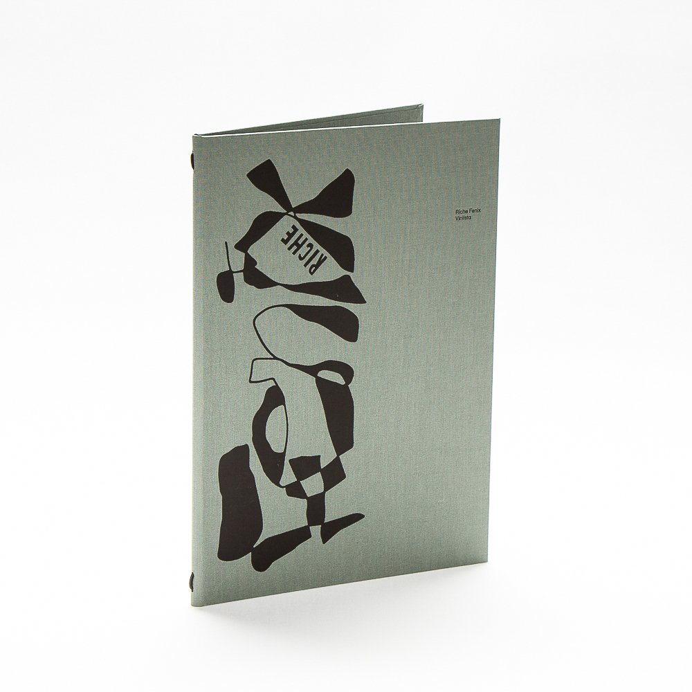
We don't just go to hotels, restaurants, bars and cafes for great food and drink. The perfect experience can only be complete if the service is impeccable, the design and atmosphere are great and all the details are perfect. For example, the menu. There would be nothing worse than coming to a Michelin-starred restaurant for a tasting, where the whole experience would be degraded by a selection of boards from a dozen or so banal leatherette plates.
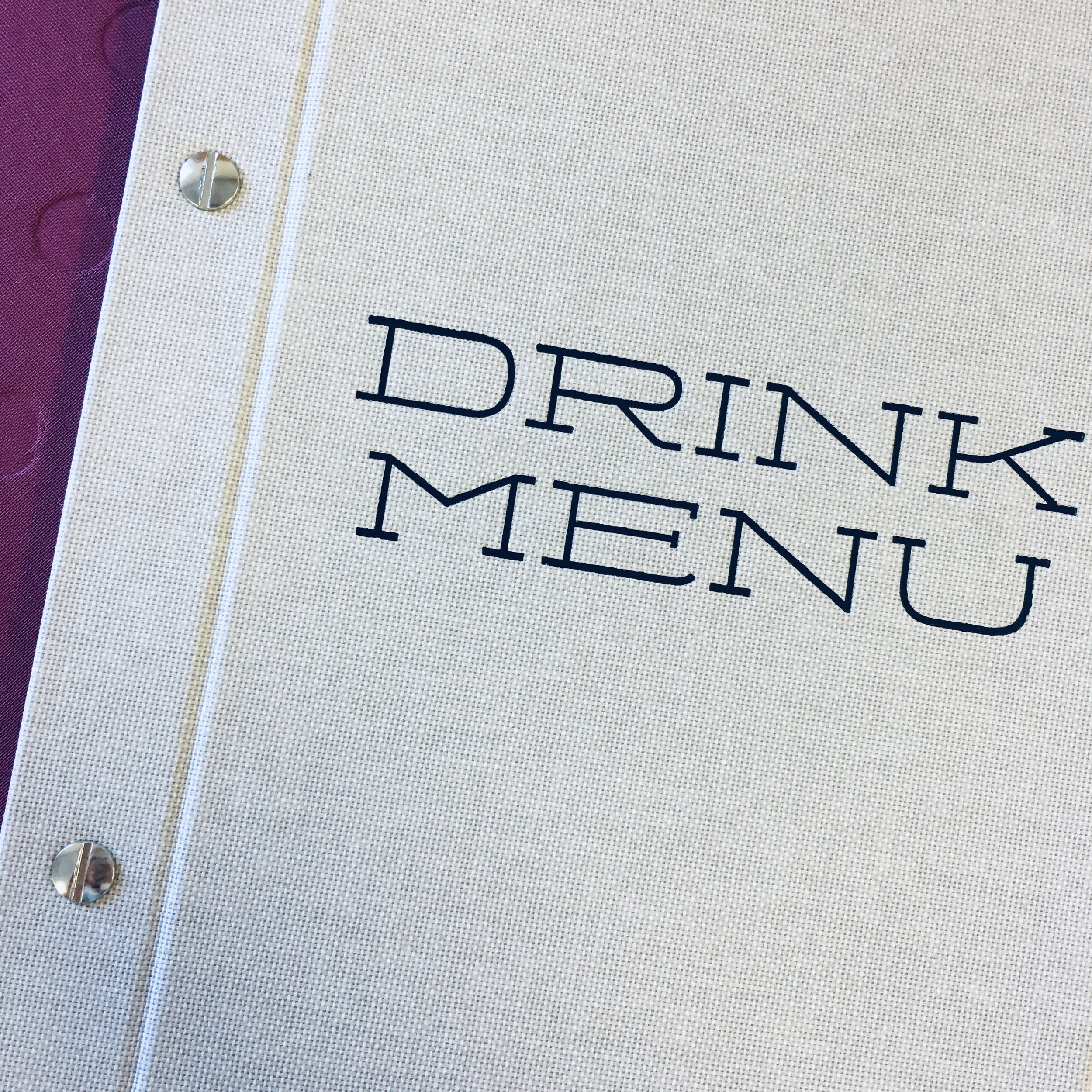
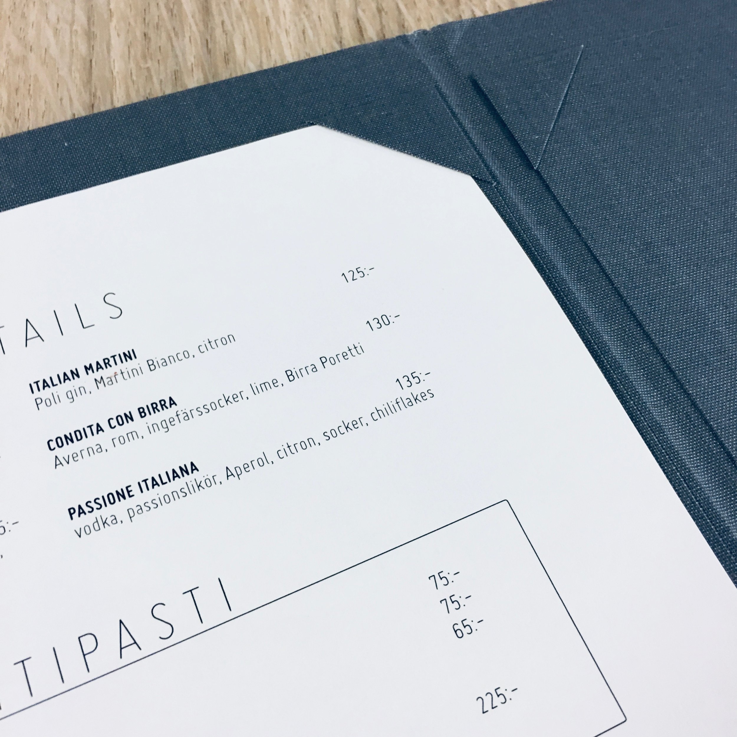
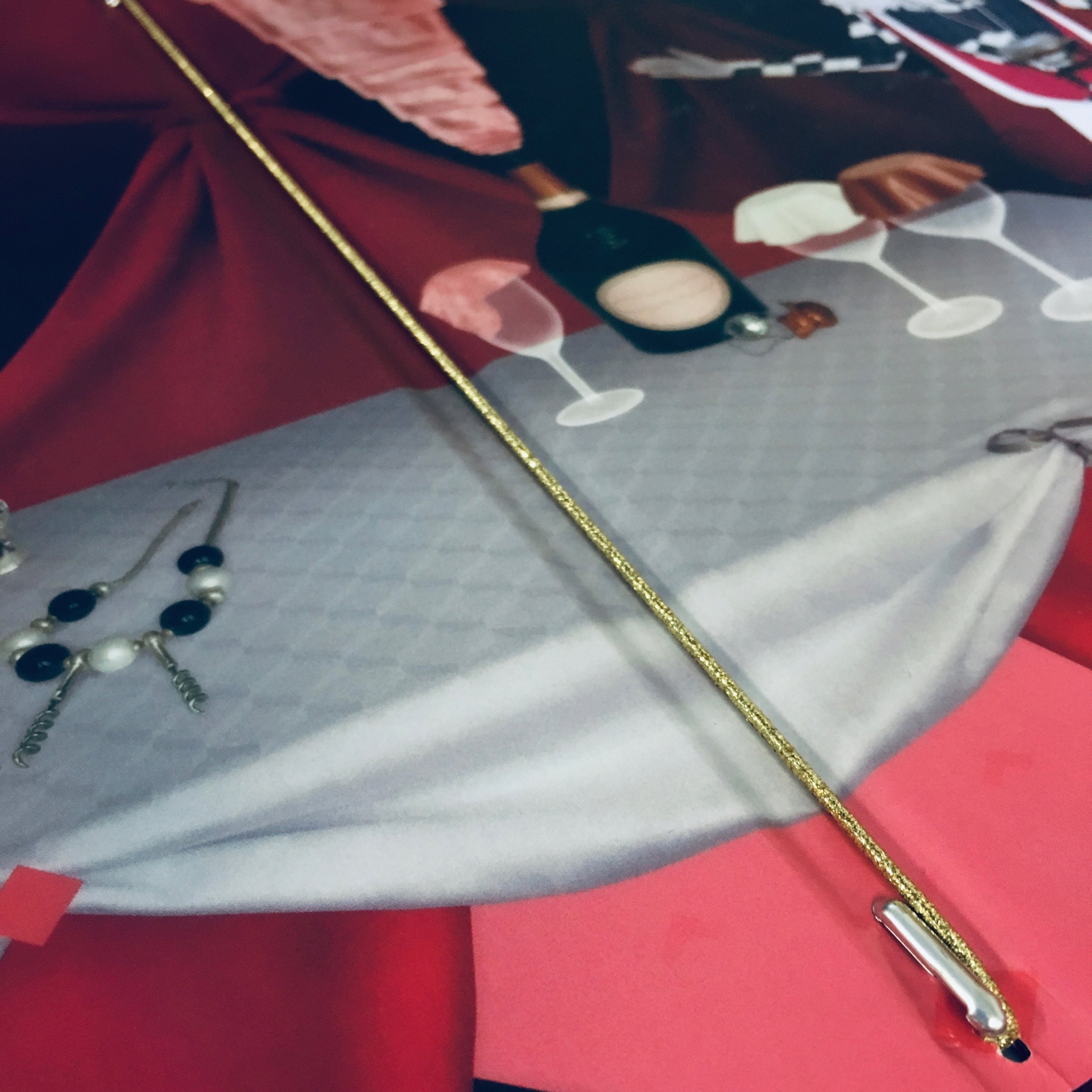
That is why we always produce the menu individually. In terms of materials, we choose from durable canvas, paper, recycled leather or polyurethanes, and we can also advise on different solutions for fixing the menu sheet. Of course, the unique embossing is also very important for the final effect. The menu should be in tune with the design of the entire brand and must fit into the aesthetic whole. Do you run a hotel? Then we recommend that a number of other guest products are linked to the Menu design, such as room information boards, "Do not disturb" sign solutions, etc. For example, for the Downtown Camper hotel in the Nordic Scandic chain, we produced a similar set in grey Colorplan, with large black embossing.
Do you need similar high quality, durable but still stylish and unique equipment for your business? Let us know. With the "Hässlers Pro" line, we're sure to offer you the solution you've been secretly dreaming of.


